- Product
- Internal strategy platform for BMW
- Goal
- A tool to absorb a global strategy and to retrieve the specific signal buried inside it
- My role
- Lead product designer: IA, creative direction, interface concepts
- Team
- Me + strategy leads + insights team
- Constraints
- Non-digital-native consultancy; fixed-canvas PPT to fluid responsive; content loss trade-offs
- Shipped
- Information architecture, creative direction, key interface concepts
- Result
- Product-ready structure for complex strategy content; shared design language across stakeholders
→ Context
BMW needed a digital platform to carry a global brand strategy into day-to-day work: align regions on one strategy, keep teams updated, and give every market a shared reference point.
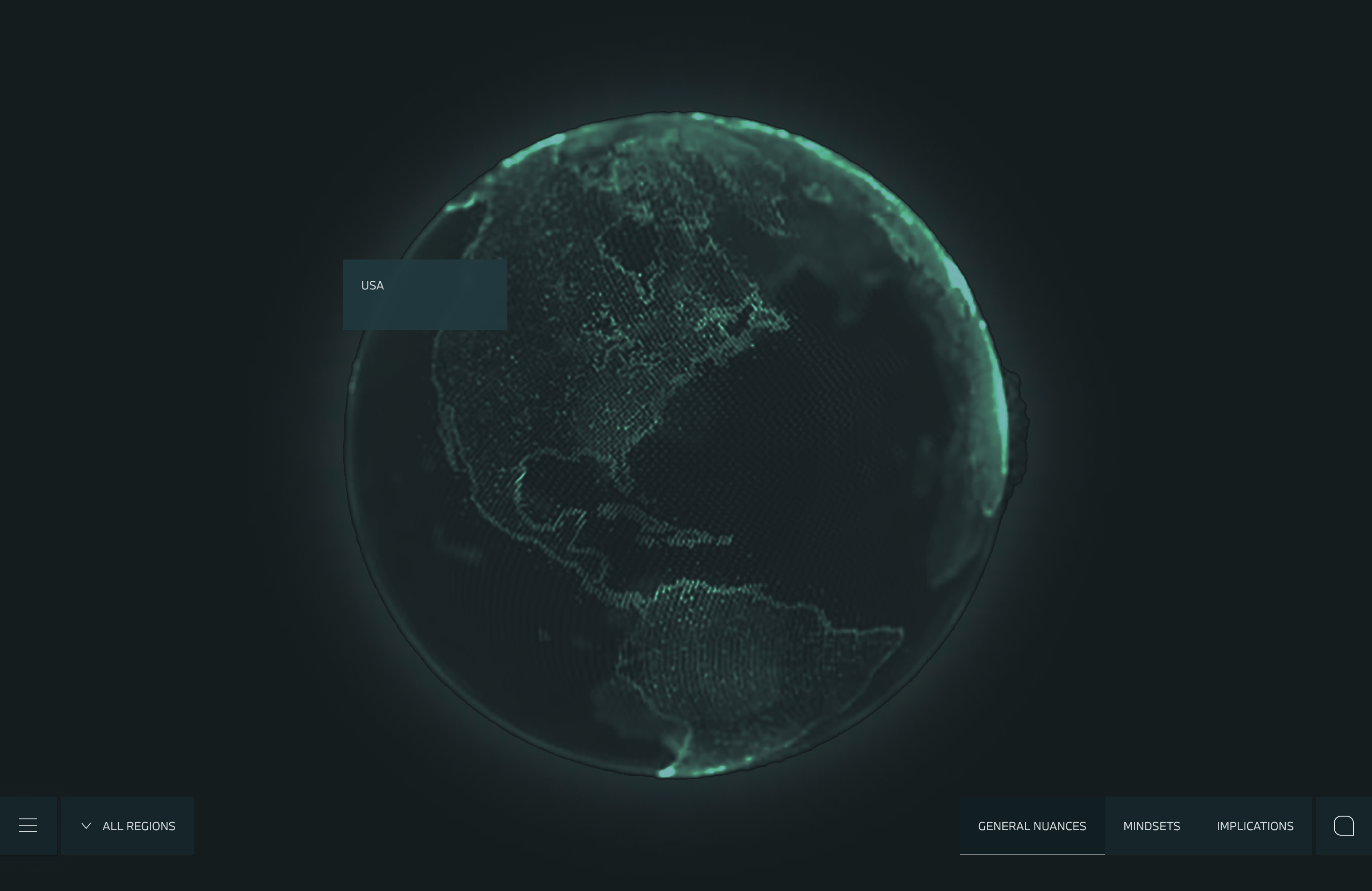
The source material was a massive PPT universe: audience definitions, regional nuances, strategic pillars and signals, all arranged for linear workshops. None of it was structured for direct access, free navigation, or retrieval.
My responsibility was to define the platform vision, creative direction, and information architecture.

→ Problem
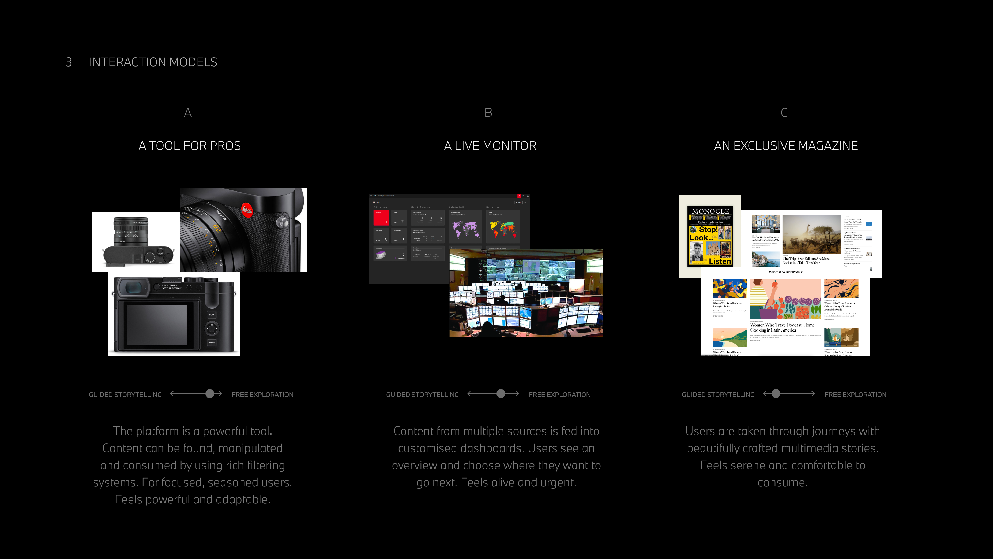
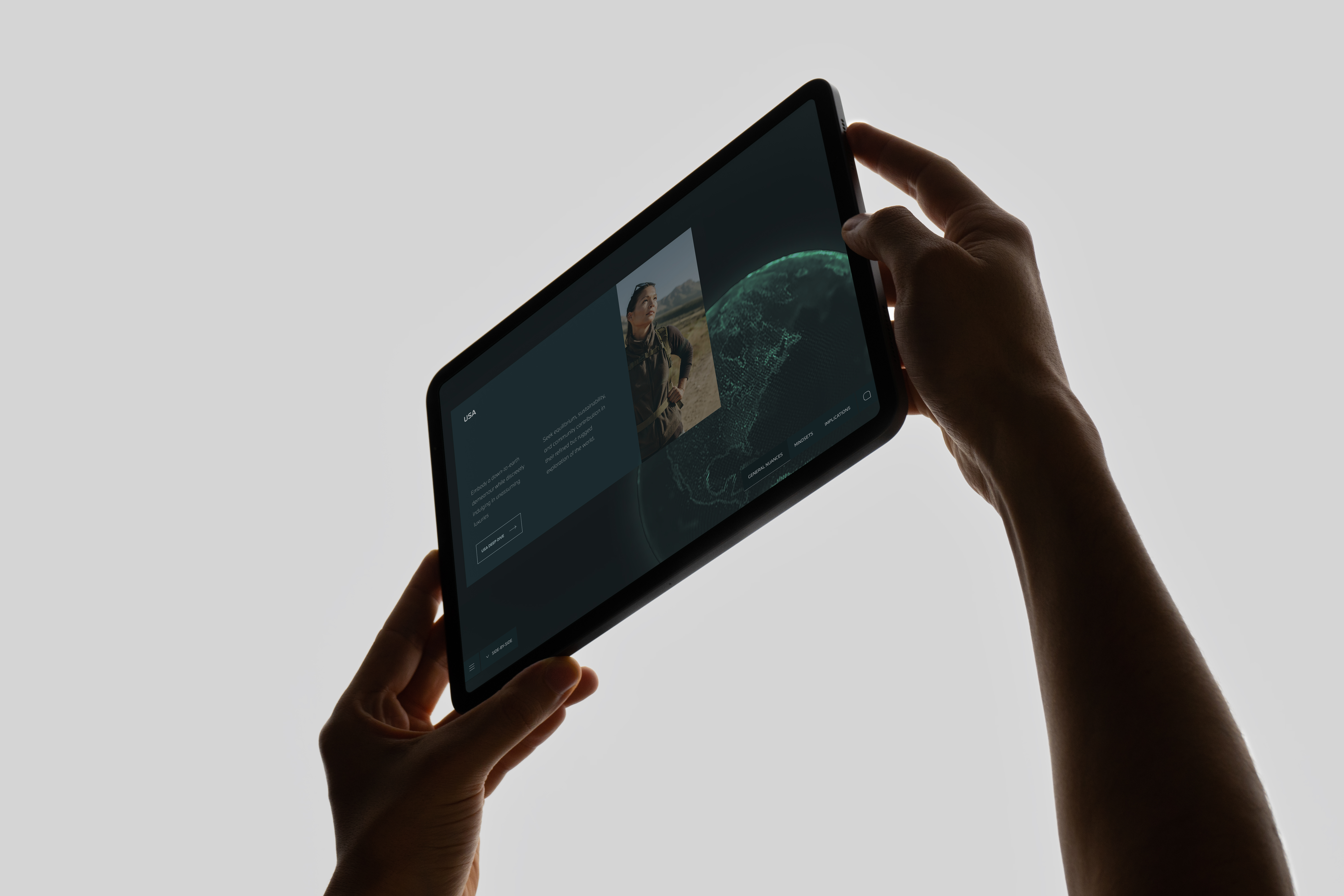
The existing materials depended on a strict, slide-by-slide story. That format works in a workshop but breaks down when a regional lead needs to answer: “What does this audience look like in South Korea?” or “Which signals sit behind this value?”.
If the platform mirrored the PPT, global teams would be stuck scrolling through someone else’s narrative instead of using the tool to support their own decisions. It needed non-linear exploration, fast retrieval, and a clear sense of location inside the content universe.
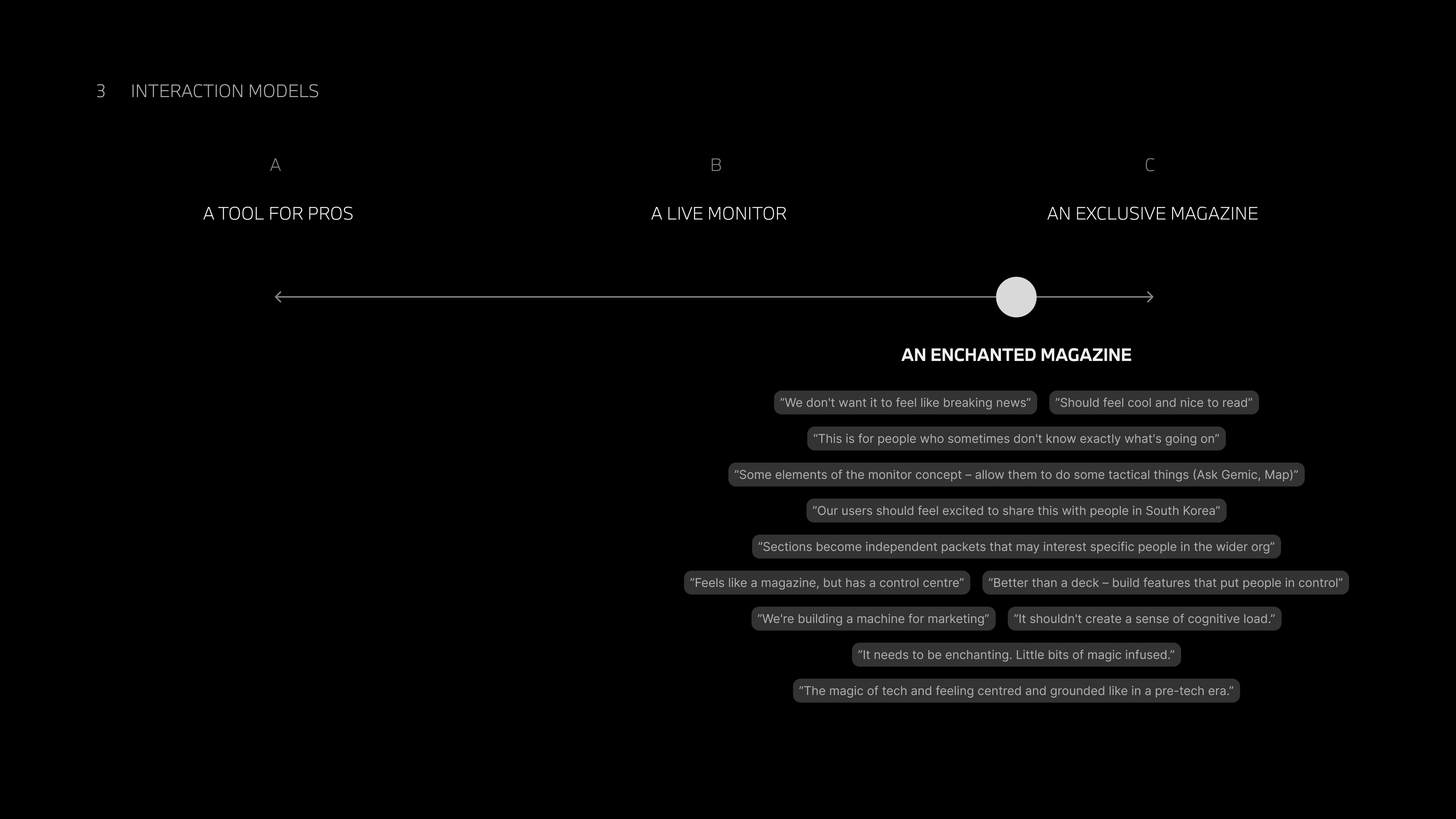
The experience also had to feel calm and premium while handling a very high level of complexity.


→ Approach
- Unpacked the slide logic with stakeholders and rebuilt it as product capabilities, content types, and navigation patterns
- Ran IA workshops with strategy and insights leads to map the documents into a digital structure
- Ran a user-stories session for the three core users: global leads, regional teams, local specialists
- Defined the key flows: audience at a glance, drill into regional nuance, connect signals to pillars, share with teams
- Held the surface calm while supporting four levels of depth
→ Key Decisions
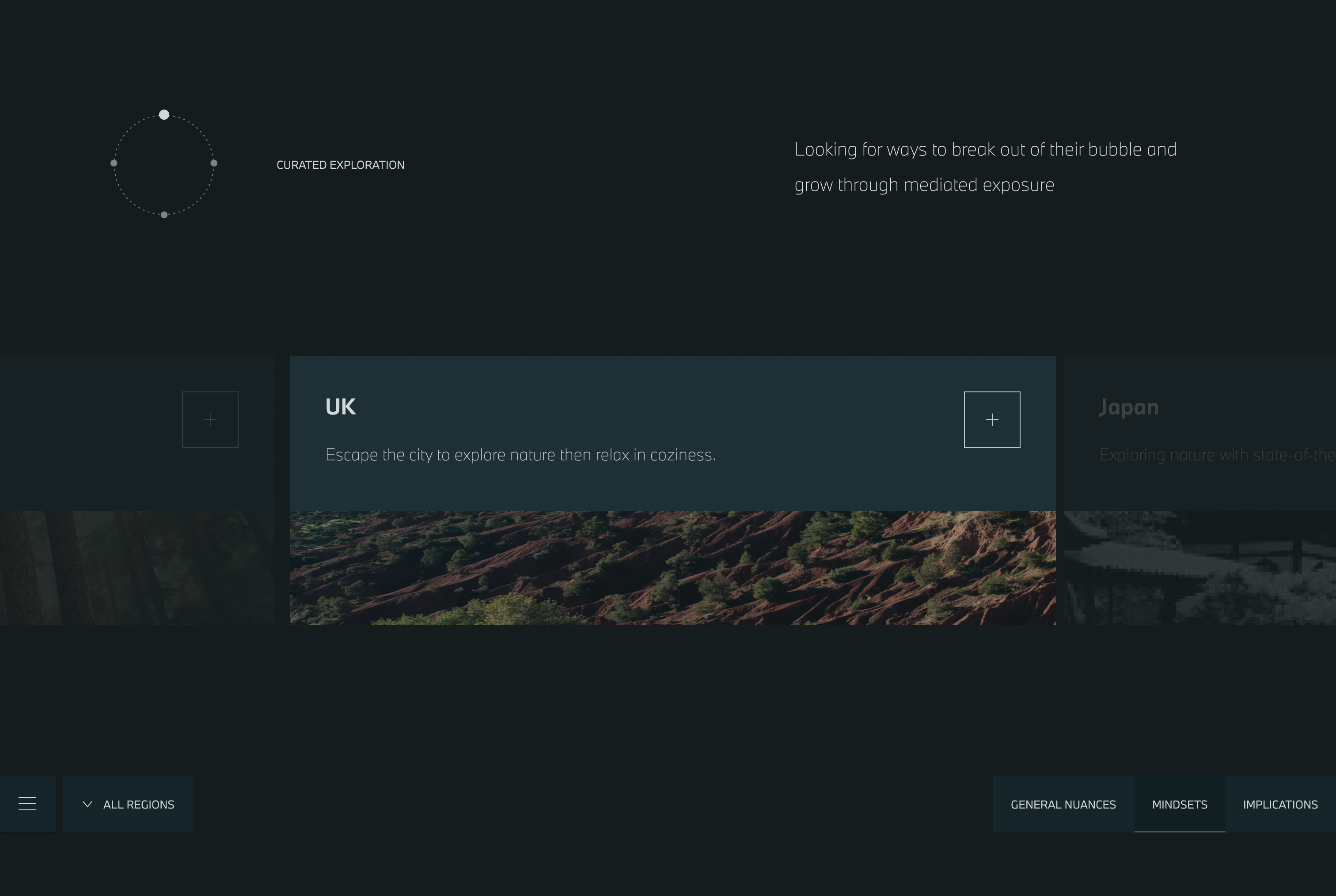
1. Replace linear narrative with modular navigation.
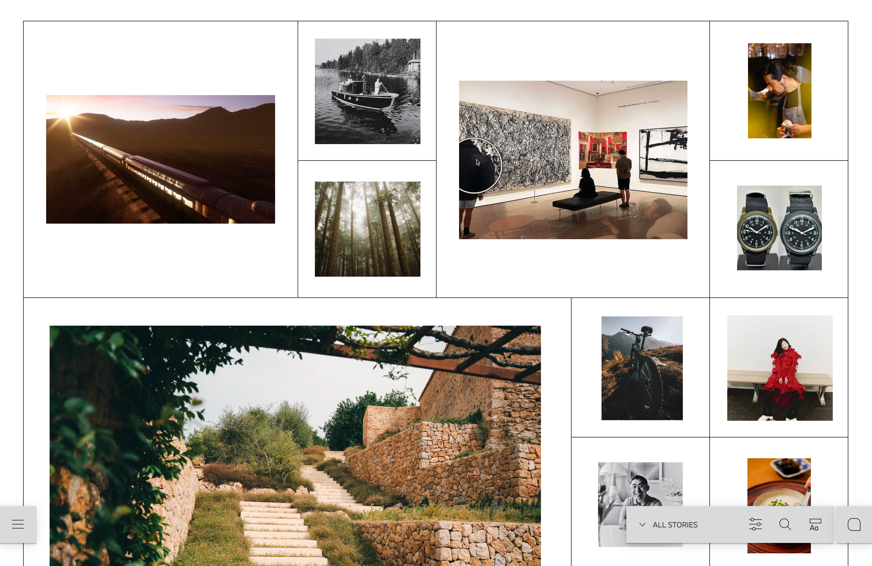
Instead of reproducing the slide order, we reorganised content into modules: audience overview, regional nuances, stories, signals and tools. Each module could be accessed directly, searched, filtered and linked to from elsewhere in the platform.
This required new labels, new hierarchy and new relationships between items. It also required accepting that some of the PPT story flow would be lost, in exchange for a tool that people could actually use day to day.
2. Design for depth while keeping the surface calm.
The platform had to support several levels of depth: global audience, regional variants, local signals and individual stories. I defined a structure where users could go deep without losing orientation, using consistent section patterns and clear “back to overview” anchors.
3. Treat responsiveness as part of the information design.
Slides assume a fixed canvas and a known reading order. A responsive layout does not. I worked with the team to redefine hierarchies so they would hold up on fluid layouts, especially on large monitors in offices and standard laptops in the field.
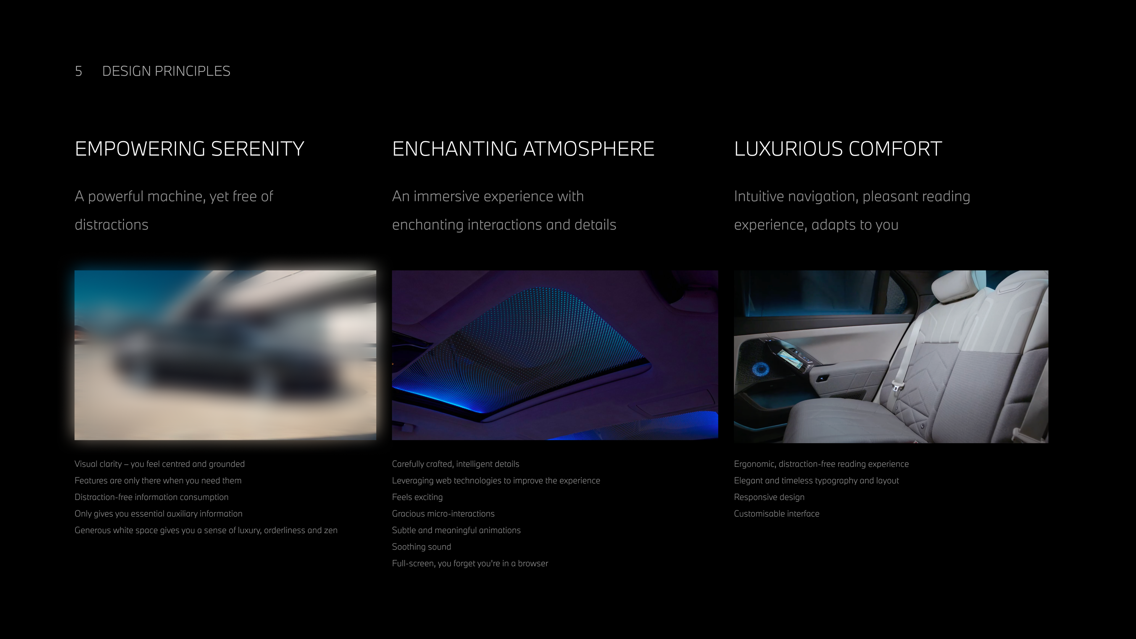
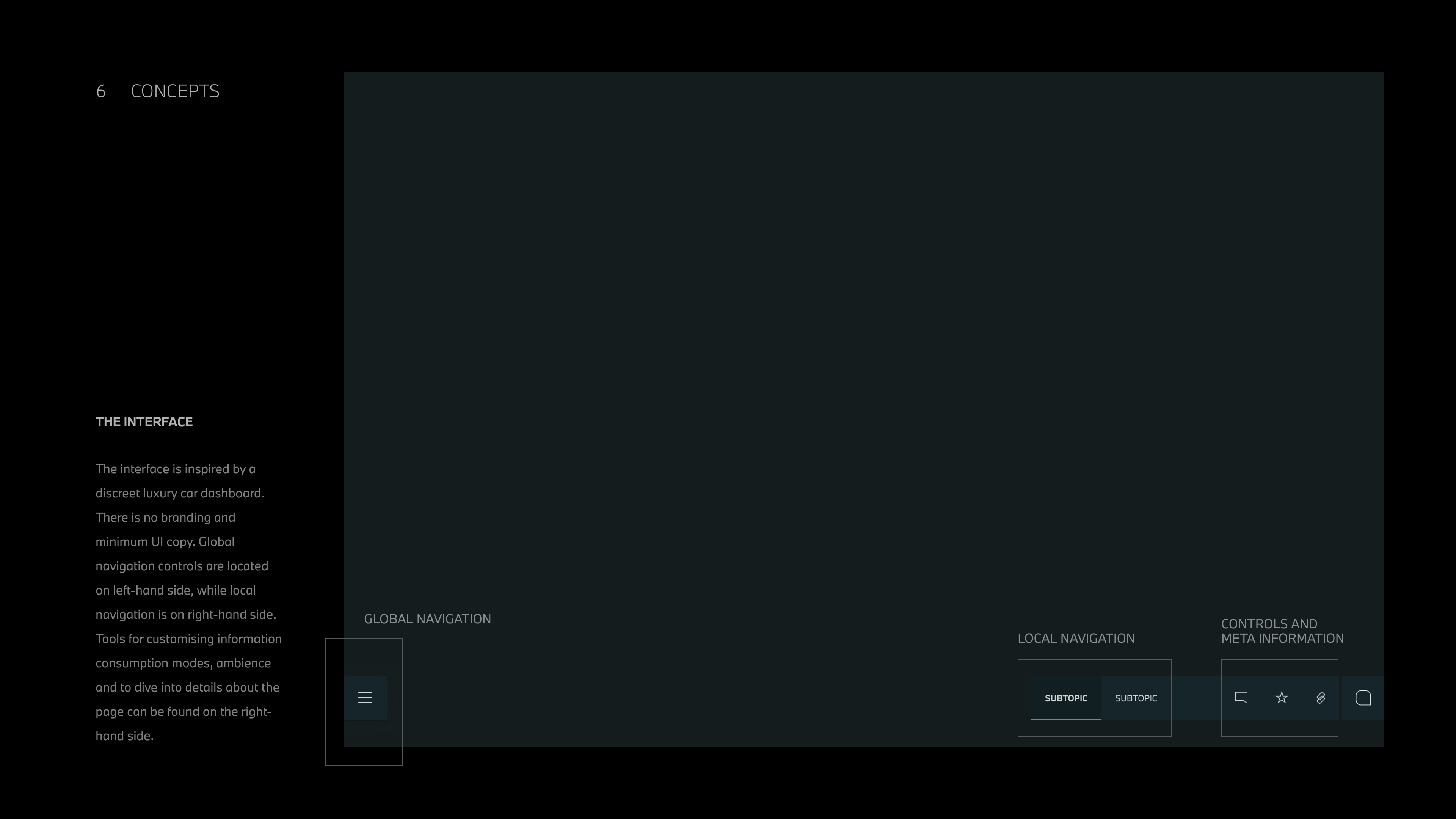
→ Creative Direction
The interface drew on cues from automotive UI and interior design: discreet lighting, layered surfaces, and controls that feel precise rather than playful. The system also adapted to content context, changing emphasis and colour tone depending on which part of the audience universe users were exploring.
We aligned around three design principles:
Empowering Serenity.
A powerful tool that stays out of the way. Visual clarity, minimal chrome and content that breathes. Controls appear only when needed so marketing leads can focus on the insight in front of them.
Enchanting Atmosphere.
Carefully crafted details, subtle transitions and restrained motion. The experience feels premium and composed, more like a high-end editorial environment than a BI tool.
Luxurious Comfort.
Ergonomic reading experience, strong typographic hierarchy and layouts that adapt to different work contexts without visual stress.

→ Systems Thinking in Practice
The work was less about individual screens and more about how the system would behave over time as new content and markets were added.
I treated each content type as a reusable object with consistent behaviour: how it appears in navigation, how it relates to other objects and how it surfaces in search and filters. This allowed strategy teams to imagine future use cases without needing a new layout each time.
The combination of IA workshops, user stories and design principles created a shared mental model for the product. That model outlives any specific visual expression and gives the client a way to evolve the platform without losing coherence.
→ Outcomes
I handed over the creative direction, information architecture and key interface concepts before leaving the consultancy.
The work achieved three concrete results for the client and internal team:
- Provided a clear, product-ready structure for a highly complex strategic universe.
- Gave global stakeholders a shared language for how the platform should look, feel and behave.
- Reassured the client that a non-digital-native consultancy could handle a multi-year digital product initiative.