- Product
- White-label platform for fitness and wellness creators, web and native
- Goal
- Make the aesthetic that attracts creators systematic, from marketing surfaces to product
- My role
- Visual language, comms design system, product design system, design workflow
- Team
- Me + head of design + COO (designer turned engineer) + product team
- Constraints
- Components must survive creator customization; web and native in parallel; an existing library that predated tokens
- Shipped
- Imagery direction and image bank, comms design system, code-based product design system publishing to web and native Storybooks
- Result
- App rebuilt feature by feature on the new system; design decisions ship as reviewed PRs; CS and the CEO produce their own comms pieces
→ Context
A white-label platform where fitness and wellness creators launch their own branded apps. Ask creators why they signed and they point to the brand: the website and marketing look like the world they want their own apps to live in.
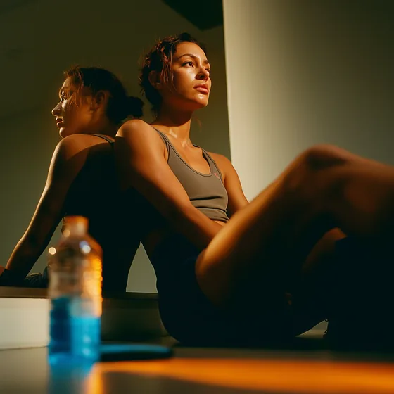
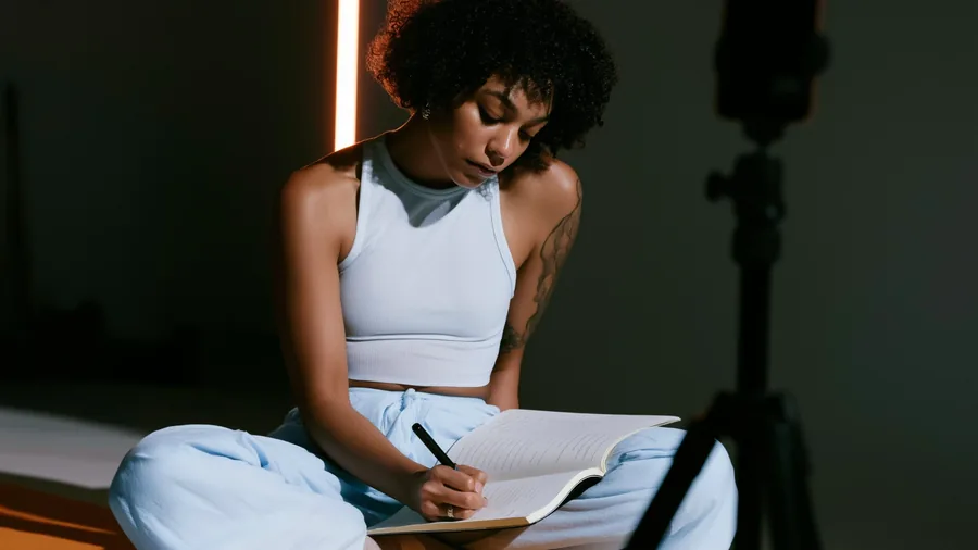
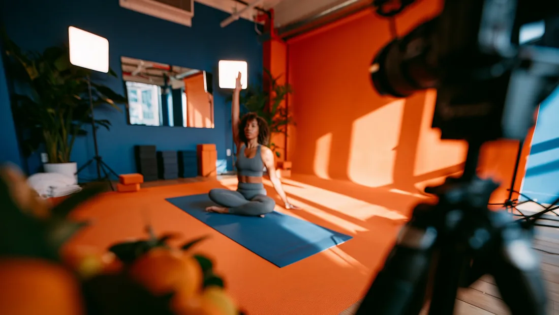
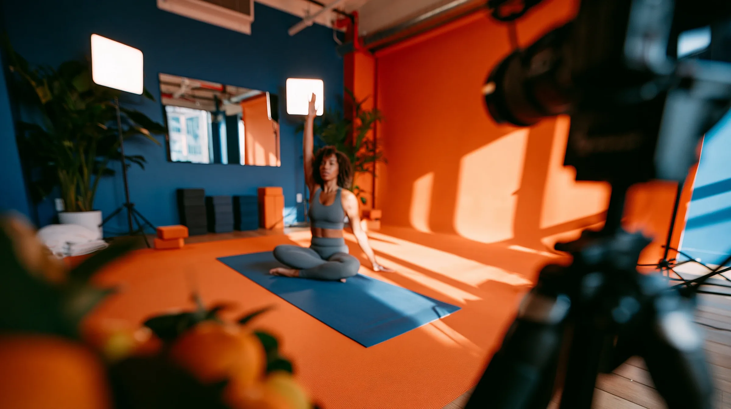
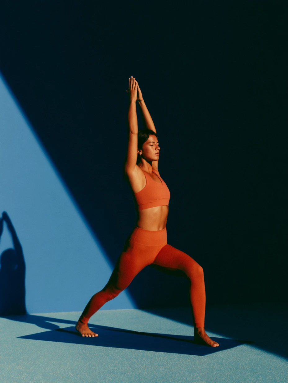
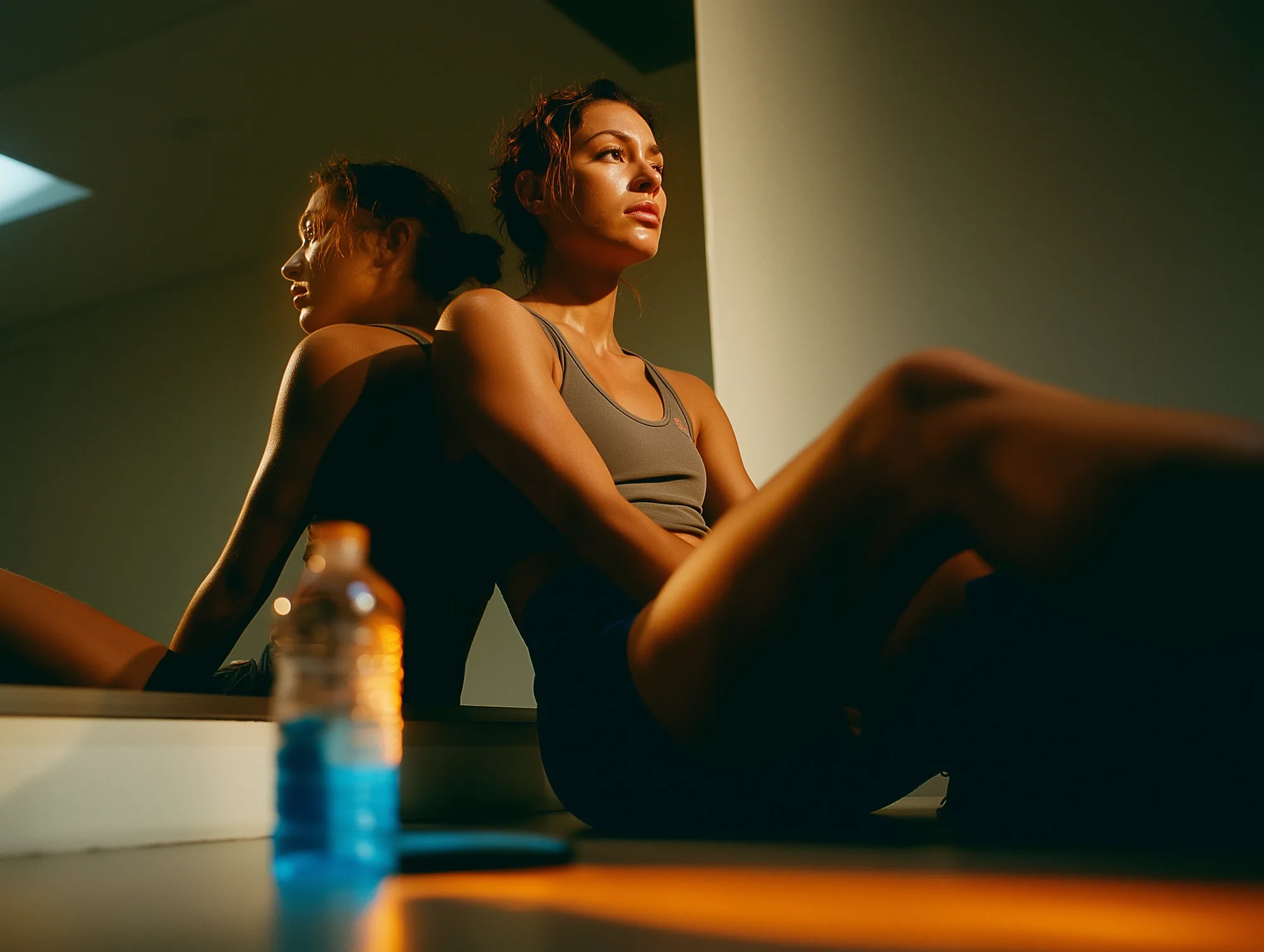
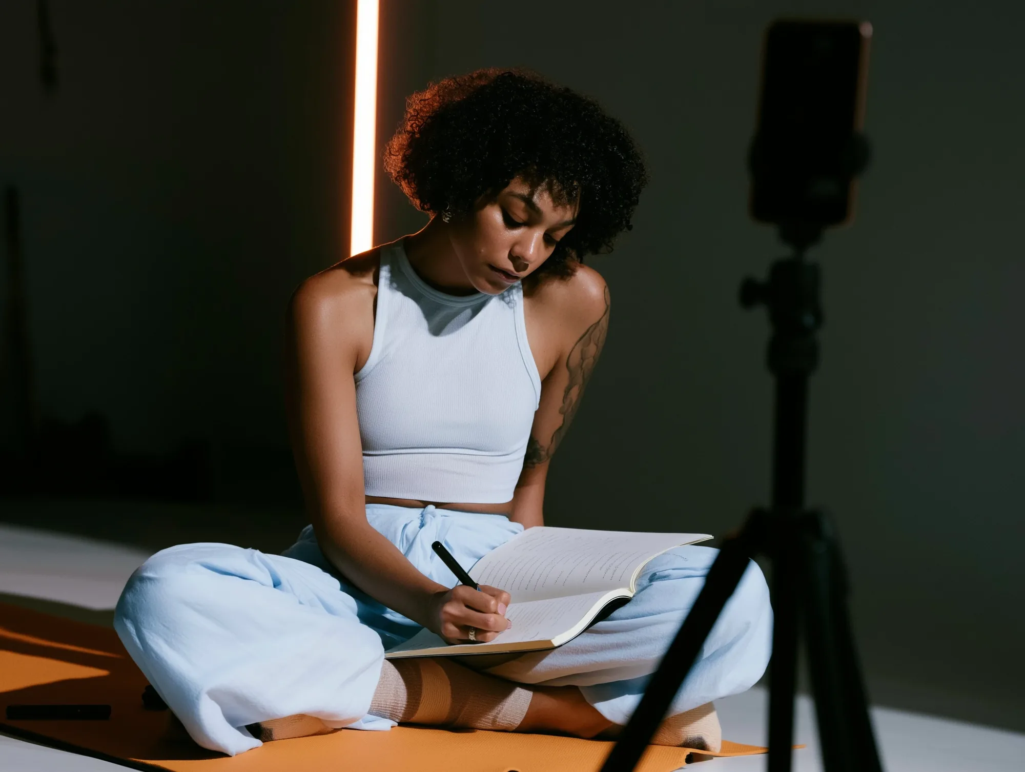
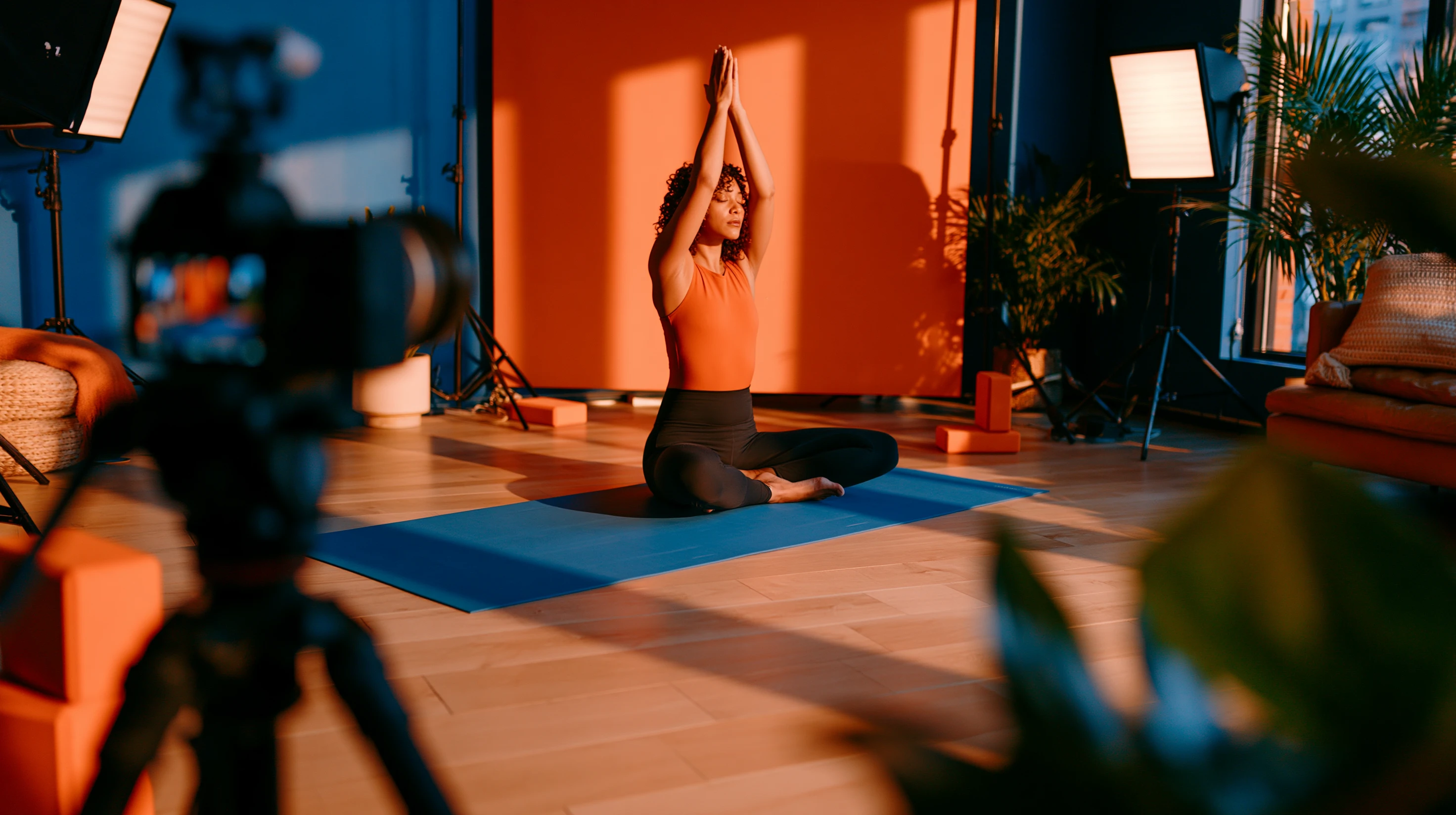
The engagement started with imagery. Fitness visuals split between two clichés: hyper-real gym content from social feeds, and flawless stock footage of perfect studios and perfect people. The platform wanted a third position, images that read as neither and never read as AI.
The work grew from there into a full visual language, a comms design system the team operates without a designer in the loop, a product design system, and the workflow to rebuild the app on it.
The bar came from the platform’s own top creators, who produce their brands at fashion-editorial level, with shoots, crews, and art direction.
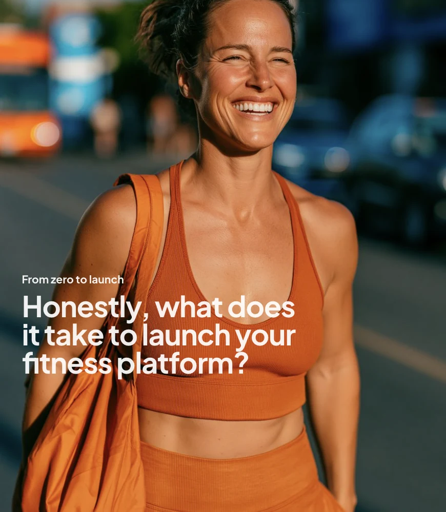
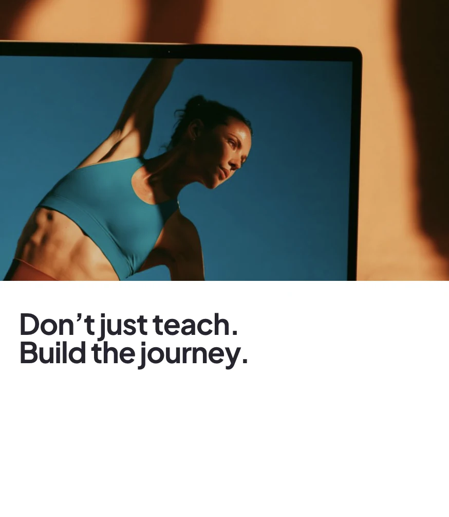
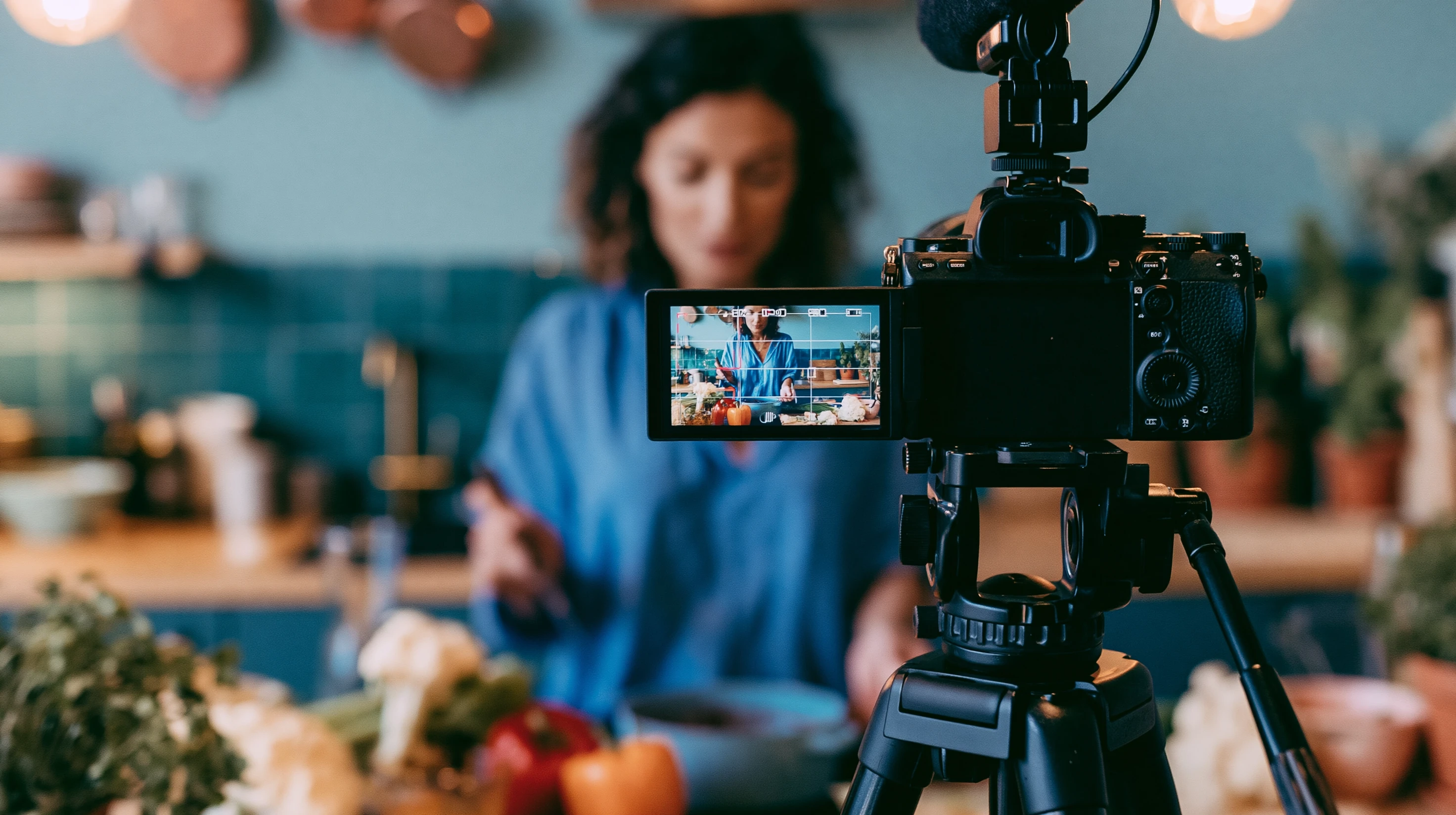
Comps made by the client team using the Marketing and Comms Design system and generated imagery.
A week of data, told back as a story
You haven't missed a week since late January, and the last two were your steadiest yet.
Every strength session this month, none for the hips they tighten. Twenty-two minutes squares that.
Three sessions, one personal best, and the body noticed.
- Mon
 Low-impact strength III Heaviest set yet: 14 kg on the goblet squat.
 - Tue
Slept 7h 50m. Your best night this month, the one after a strength day.
- Thu
 Full-body flow Your longest session so far.
 - Fri
Resting heart rate 58. Three beats lower than the week you started.
- Sat Evening wind-down Fourth Saturday in a row.
- Sun
Rest day. Earned.
Four values in, a whole card out
A joint-friendly session that builds real strength without pounding your knees. Dumbbells if you have them, a sturdy chair if you don’t.
→ The Visual Language
The organizing concept came from fashion and art magazines: creators are the artists, and the system treats them that way.
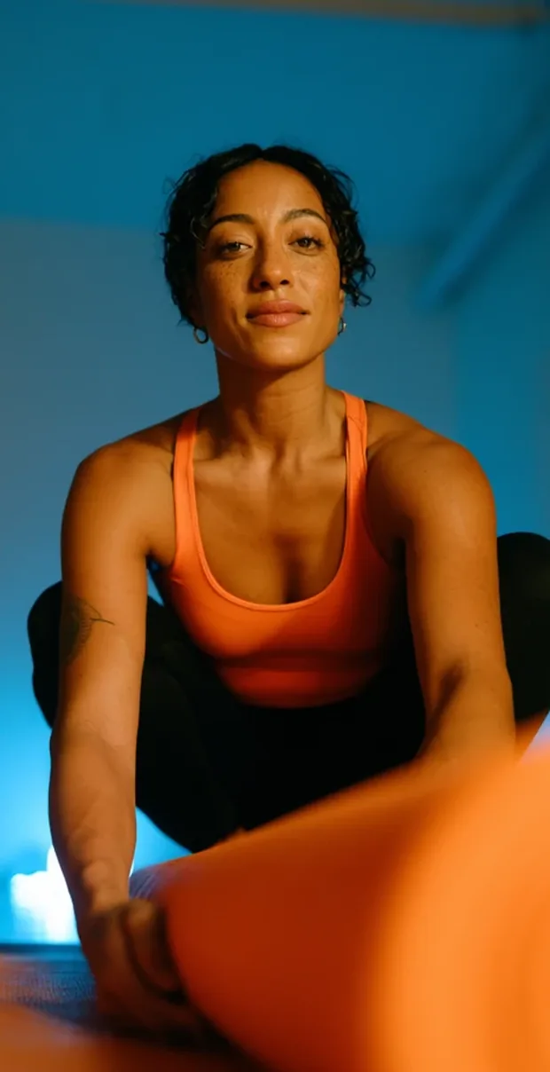
Bodies appear as form and movement, not as before-and-after. Natural light, warm neutrals, film grain over digital sharpness. Imagery gets the treatment a gallery gives its work: generous borders, generous white space, copy that sits beside the image, never over it.
Warmth lives in the photography. The interface chrome stays close to achromatic, warm white and near-black, so color enters through the image.
Typography works as architecture: a bold sans paired with a contemporary serif, hierarchy built from scale and space, sharp edges throughout. The rules are about ratios, not taste, which is what makes the system usable by people who don’t design.
One promoted piece, three shapes
Fifteen minutes of hips, spine and shoulders, built for people who sit down for a living.
→ The Process
- Mapped the territory: research across thirty brands and twenty creators.
- Mood boards, then an imagery direction, then a generation pipeline and an art-directed image bank.
- Codified the comms design system in Claude Design; the team now makes its own reports, decks, banners, and social posts.
- Derived the product design system from the editorial one and moved it into code.
- Features get spec’d by an agent from the app repo, then designed live in web and native playgrounds, in the browser.
- Every component is audited by a review skill before promotion: token integrity, hardcoded values, redundancy.
- Promotion is a reviewed pull request to web and native Storybooks in one monorepo; playgrounds publish as working prototypes for engineering.
→ What Failed First
Three attempts at the product design system failed before one worked.
- Reusing the editorial system for product screens. Editorial systems are opinionated. They ask for copy, density, and layout drama that product surfaces can’t sustain.
- Generating screens from the system with AI tools. Every session reinterprets the system, so the same request produces different screens on different days. Great for exploration, no good as a source of truth.
- Rebuilding in Figma. The library predated the token structure that would let a change cascade, so improving the system meant rebuilding components one by one, by hand. Progress was real, just slow.
→ The Decisions
- Source of truth in code. The one place where tokens, review, and both platforms live together. The COO, a designer turned engineer, proposed it; I agreed on the spot.
- Derive, don’t dilute. The product system keeps the editorial DNA, sharp corners, hairline rules, the type pairing, as an optional layer over a clean core.
- Gate promotion behind an audit. No component enters the system with broken tokens, hardcoded values, or a job an existing component already does.
- Design in the browser. Iteration happens against real rendering and real states, web and native side by side. Claude Design generates variations in parallel when the first output plays it too safe.
- Freedom with guardrails. Creators get fewer options where choice creates setup friction, more where it creates expression: component variants, layout options like grid versus carousel.
- Let native diverge. Modules are redesigned per platform rather than forced into parity.
- Specs as the handoff. Engineers get the spec and a running prototype, then implement in their own stack.
One component, two layouts
Wind-down breathing — before sleep
→ Designing for White-Label
Every decision above has to survive the platform’s defining constraint: creators customize their apps.
A handful of brand inputs fan out across hundreds of variables. Fonts come from a curated pool, palettes are adjustable, and pages are assembled from modules, so a component is never seen in one context with one typeface. It has to look composed under combinations nobody previewed, and it has to make a solo creator shooting on a phone look as intentional as one with a production crew.
The seam is deliberate. The system holds the grammar, the spread logic, the type ratios, the spacing discipline, while the creator’s brand fills it.
One screen, three brands, three weeks
→ Outcomes
The app is being rebuilt feature by feature on the new design system, with design decisions shipping as reviewed pull requests to both platforms.
- The comms design system is in daily use across social, the website, reports, and decks, run by the team through Claude Design.
- One design system publishes to web and native Storybooks from a single monorepo, so the two platforms stay in step.
- Every promoted component has passed the token audit, so the system stays clean as it grows.
- Engineers work from specs and running prototypes rather than static redlines.
Built to be read from the floor
Press play. Tap the frame to send the controls away and bring them back.