- Product
- Brand and digital presence for energy technology startup
- Goal
- Design credibility for novel tech that couldn't be fully disclosed
- My role
- Brand + early product UI foundations (direct report to CEO)
- Team
- Me + CEO + copywriter
- Constraints
- Tech couldn't be disclosed; space crowded with overpromising; CEO wanted revolutionary narrative
- Shipped
- Visual identity system, website, product UI foundations, narrative structure
- Result
- First cohesive public presence used in early investor/funding communication
→ Challenge
Design credibility for a novel energy technology that couldn’t be fully disclosed, in a space crowded with overpromising narratives.

→ Context
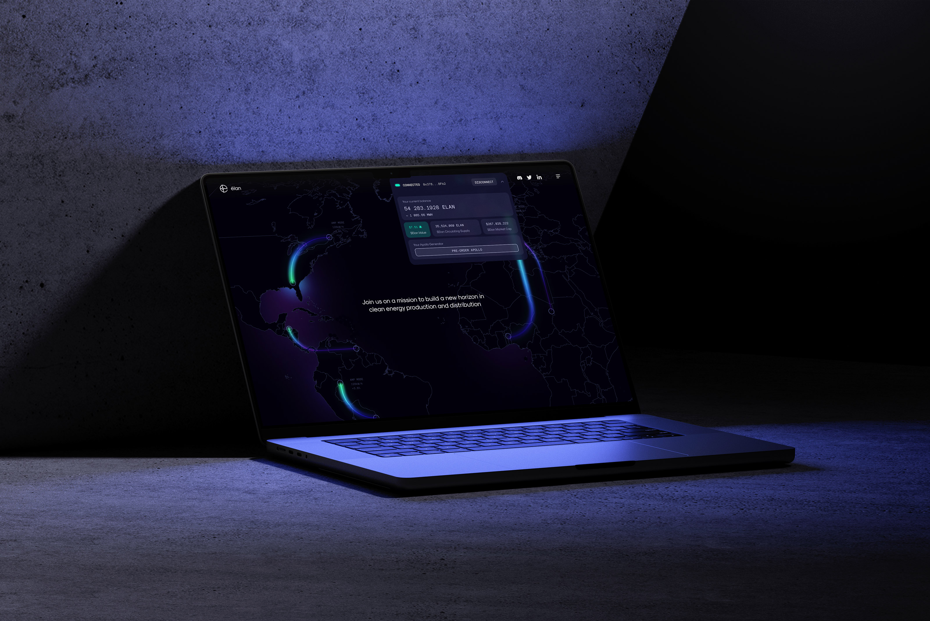
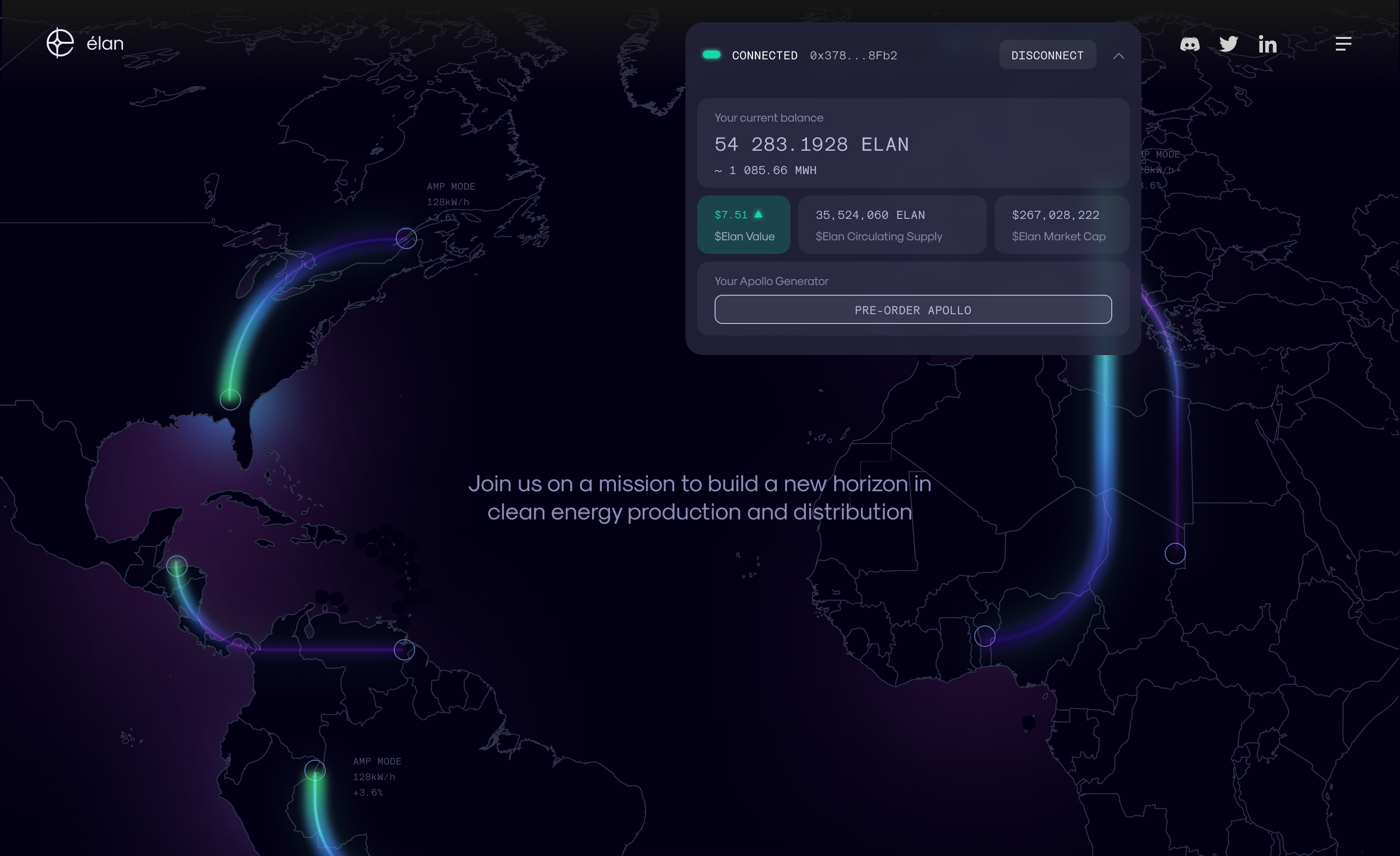
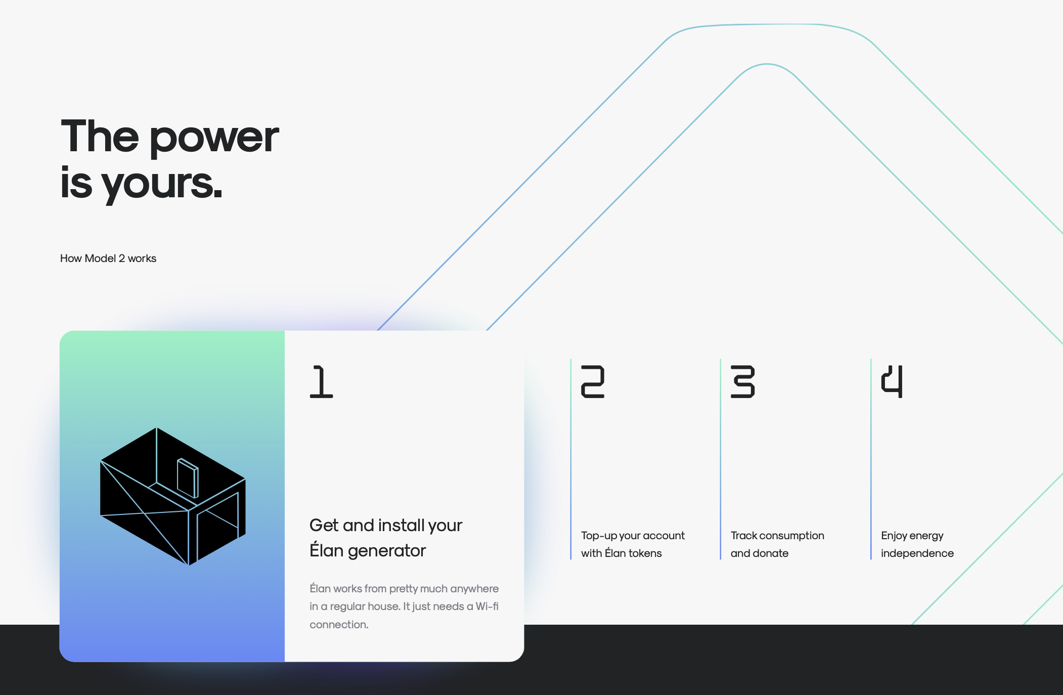
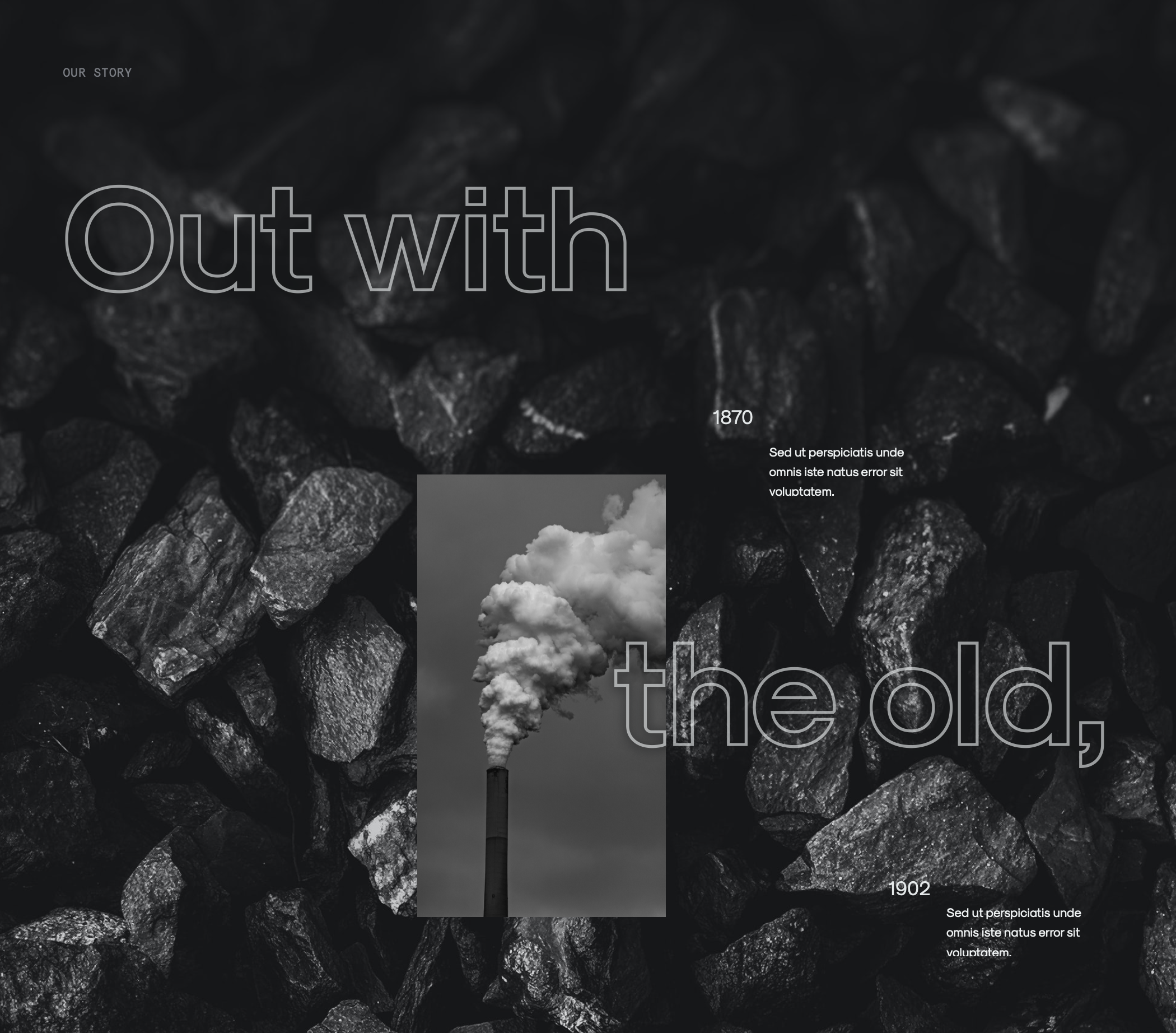
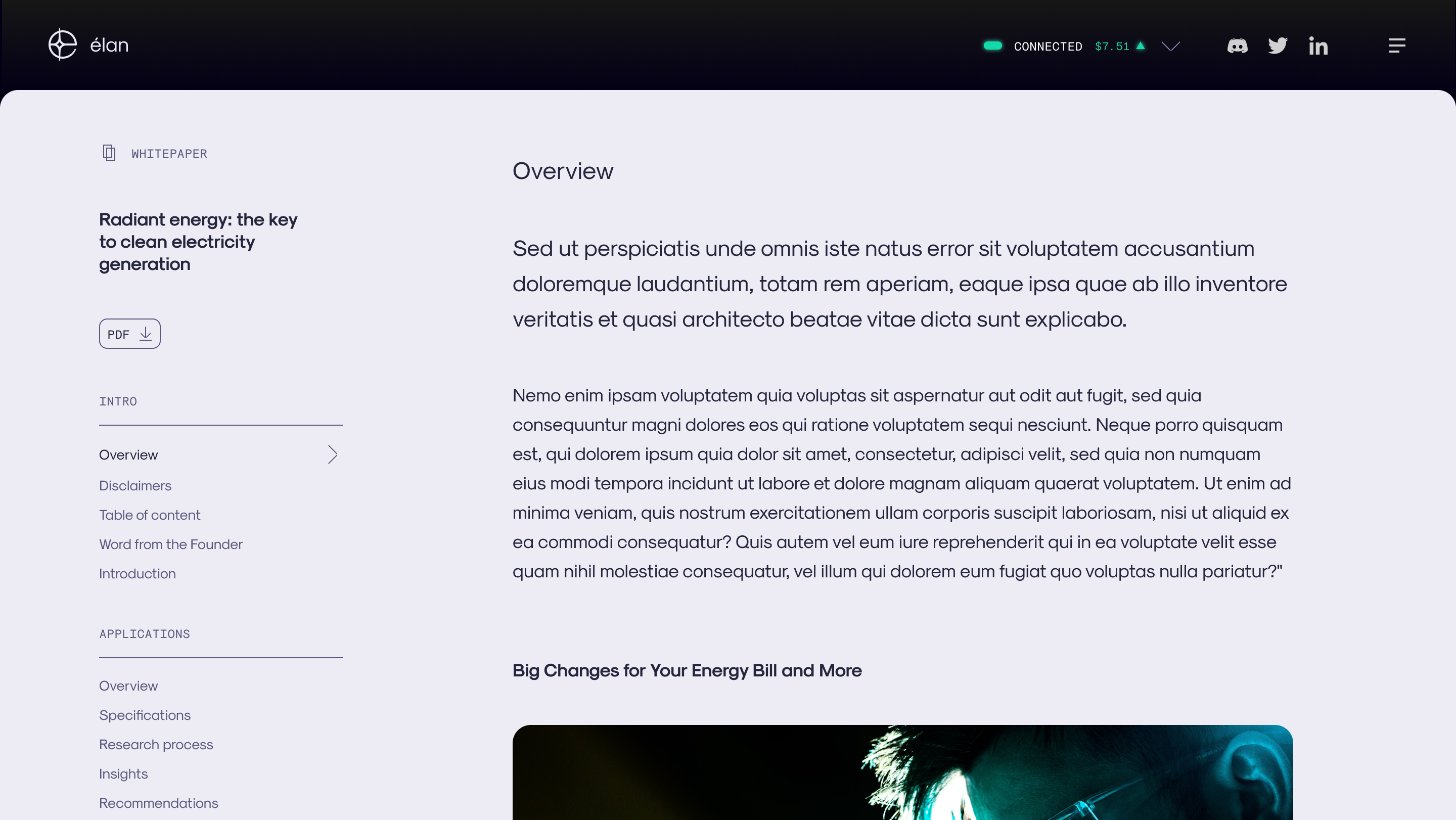
Élan was an early-stage research lab in Canada, working on home-based energy technology that promised to break dependence on centralized electrical grids. The ambition was radical: shift power, literally, into the hands of individuals.
There was no public product, limited disclosure, and the category was already filled with big promises. How do you design credibility when proof can’t be fully revealed?
→ Key Insight

→ Process
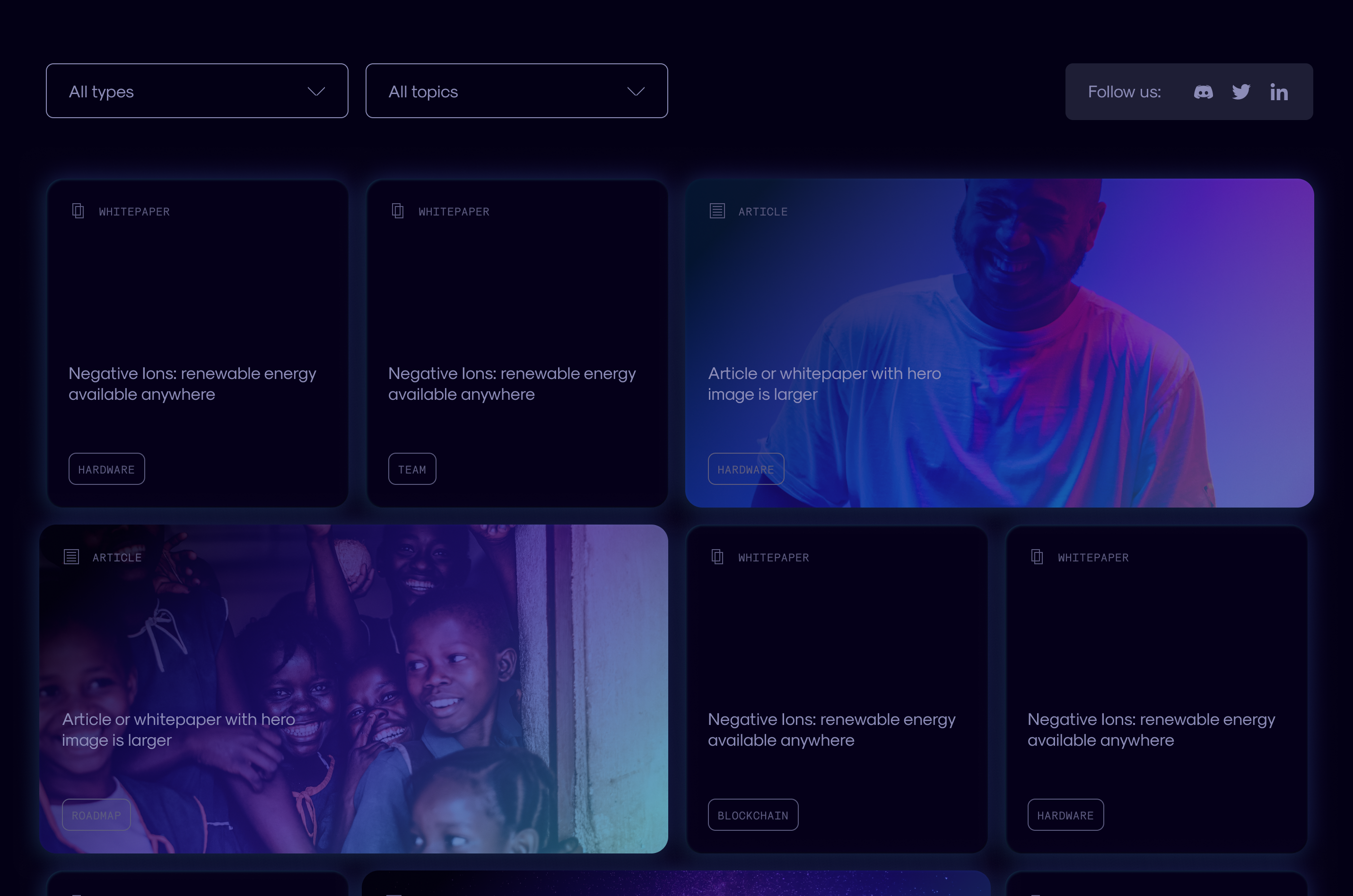
- Defined narrative structure and pacing of reveals across the website
- Pushed for tangible inputs: 3D product renders, technical specifications, clear explanation of how the technology works for end users
- Designed visual identity system: logo, typography, color, layout principles
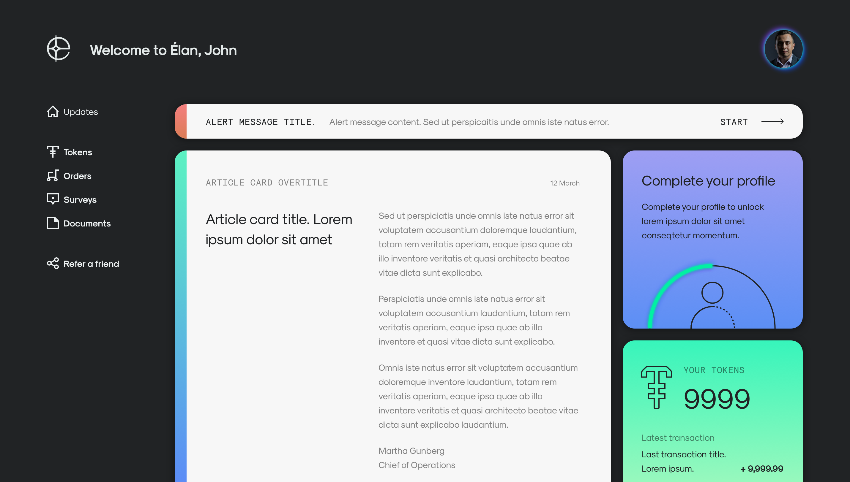
- Extended brand into product UI: account views, wallet interface, dashboard
- Collaborated with copywriter, shaping section hierarchy and balancing poetic statements with grounded explanations
→ Key Decisions
Technical and editorial visual language
To counter the “magic” perception problem in frontier tech, I developed a visual system that felt precise and grounded. The typography, layouts, and color choices borrowed from technical documentation and editorial design.
Material signals over symbolic imagery
Prioritized product renders and specifications instead of stock optimism.
Early UI validation
Validated the identity could survive contact with functional software by designing real UI early. The brand needed to work in dashboards, account views, and data-heavy interfaces.
→ Outcomes
The final site still carried plenty of revolutionary language—the CEO got his movement narrative. But alongside the fluffy promises, users could see actual product renders, read technical specifications, and understand how the technology would work in their homes.
- Shipped Élan’s first cohesive public presence
- Created scalable system that extended from brand into product UI
- Established material credibility alongside the aspirational narrative